Using the WebModeler
This document provides an overview of the WebModeler user interface along with best practice for getting started.
The WebModeler's design interface is divided into three tabs - Interface, Screens, and Widgets. A web interface is configured using the Settings pane.
Interface Tab
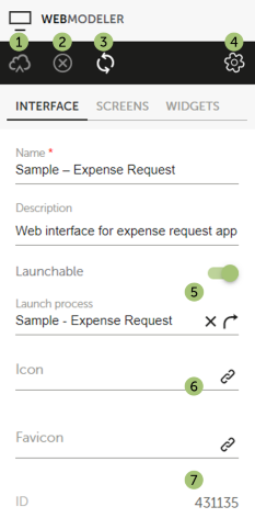
When you first open the WebModeler, the Interface tab is open by default. Here you can define high-level settings for your web interface, for example a name, a description, or an icon.
The left-hand pane looks like this:
| Number | Description |
|---|---|
 |
Saves the changes you make to the web interface. Only after clicking this icon are you able to preview the current implementation of your web interface. |
 |
Cancels all changes made to the web interface since you last saved it. |
 |
Retrieves the web interface as it is currently stored on the DigitalSuite server. |
 |
Opens the Settings pane to manage the web interface's settings and configure any API listeners. |
 |
Switch on Launchable, if a process is to be started by the web interface. Clicking in the field opens a dialog where you can select the process. If you choose a process from another project, this project will be added as a subproject to your current project, unless this has already been done before. |
 |
Click the link icon to open a dialog for selecting an image to be used as the thumbnail for the web interface on a homepage or as its favicon, respectively. The image must have been uploaded to DigitalSuite before. |
 |
Displays the web interface's unique ID, which is generated automatically. |
Screens Tab
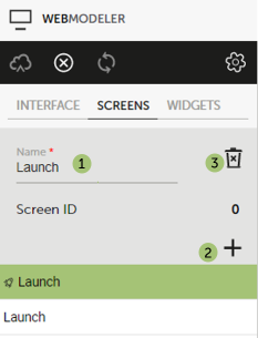
When the Screens tab is open, the left-hand pane looks like this:
| Number | Description |
|---|---|
|
Enter a name for your screen. The first screen is usually the launch screen and its ID is 0. Please note that you can re-order the screens to reflect their order in the process by using drag-and-drop on their names. |
|
Allows you to add another screen, the new screen will be a copy of the current screen. |
|
Deletes the current screen. |
Widgets Tab
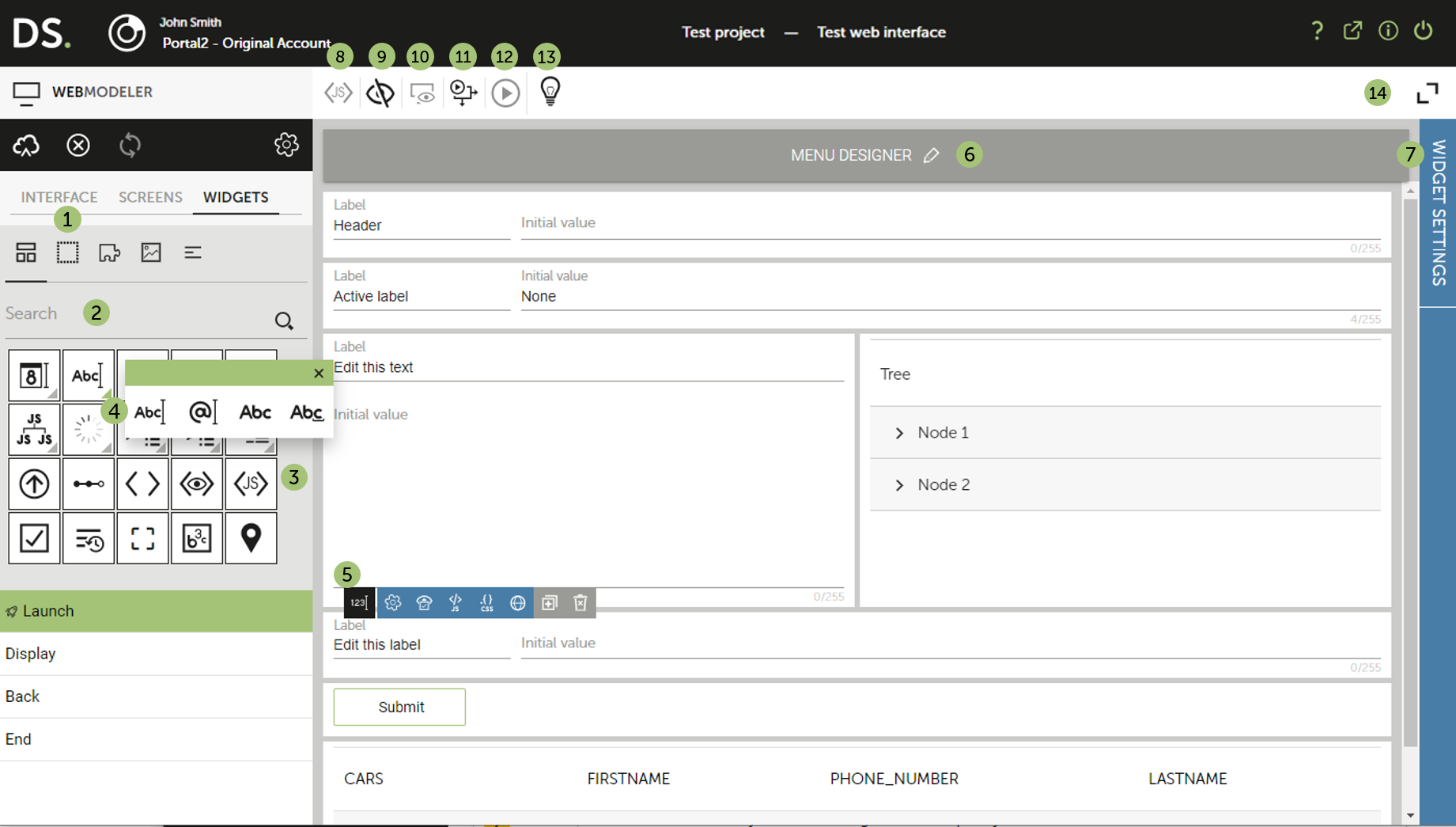
The Widgets tab offers a range of widgets that you can use to design your web interface. The widgets are organized by categories. To use a specific widget, drag and drop it onto the stage in the right-hand pane. Find more information about each widget in our Widget Types document.
| Number | Description |
|---|---|
|
Click a category of widgets to browse (simple, container, images, etc.). |
|
Enter the name or a keyword for a widget to find it quickly. |
|
Here you can browse the icons of all widgets that belong to the currently chosen category (in the example, the category is Simple Widgets). Choosing a different category can be done at point 1. Use drag and drop to add a widget to your screen. |
|
When clicking a widget with a small triangle at the bottom right-hand corner, a list of widgets of the same type is displayed. Hovering over an icon displays the name of the respective widget. |
|
When hovering over a widget located on your screen, you are offered a button bar with a range of actions, e.g. viewing the widget's settings. The settings are categorized for quick access. To view all the settings for a widget, choose the Global option, which will open the Settings pane. Help on each setting is available when you expand the Settings pane. |
|
Allows you to design a menu bar, which will be displayed in the header of the web interface, as well as to define header settings such as a title or task basket. |
|
Displays the settings of a selected widget. Help on each setting is available when you expand the Settings pane. |
 |
Directly accesses the Settings pane to add JavaScript to the web interface. |
 |
Allows you to view which widgets are visible on the current screen. |
 |
Starts a preview to see how the web interface will look like when deployed. |
 |
Opens the process launched by the web interface in the ProcessModeler. |
 |
Launches the web interface in Test mode. |
 |
Displays WebModeler overview information. |
 |
Expands the stage to full-screen mode. |
Settings Pane
Web interfaces are configured from the Settings pane; it is accessed by clicking Settings on the button bar on the left pane.
In addition to web interface settings, the pane can be used to manage other resources that your web interface may make use of.
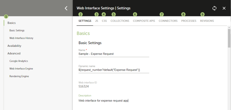
| Number | Description |
|---|---|
|
This section contains an index for the current settings category. Use this for quick access to the setting you want. |
|
From here you can manage the web interface's basic settings, view its history, choose its device availability and manage advanced settings such as using Google Analytics. |
|
Add JavaScript for the web interface. |
|
Specify layout options and manage the stylesheets to be applied to the web interface. |
|
Manage any collections to be used by the web interface. |
|
Configure a listener that will trigger a composite API upon a specified event. |
|
Configure a listener that will trigger a connector upon a specified event. |
|
Configure a listener that will trigger a process upon a specified event. |
|
View a list of your web interface's revisions. You can color code a revision, preview a revision, or revert to a previous revision. |