Web Interface Design
In this section, you will learn how to design the web interface for your application.
The web interface and the process reflecting the business logic of your application are closely related. Usually, you design the web interface first. For planning the design of screens and rule settings, it is required that you have a clear understanding of the process and what the web interface to be connected to it is to look like.
Designing a Web Interface
To create a web interface, proceed as follows:
-
Open the project for which you want to create the web interface. It is recommended that you create one web interface per process.
-
Select the type of web interface you want to create, and define a name for it.
-
Build the initial launch screen with all widgets required for the process. This screen triggers the process. It must have a button to start the process. For details, refer to the sample application.
-
Create and configure the additional screens required for the workflow steps of your application. By using screens, you can design different forms for the same web interface. For details, refer to the sample application.
-
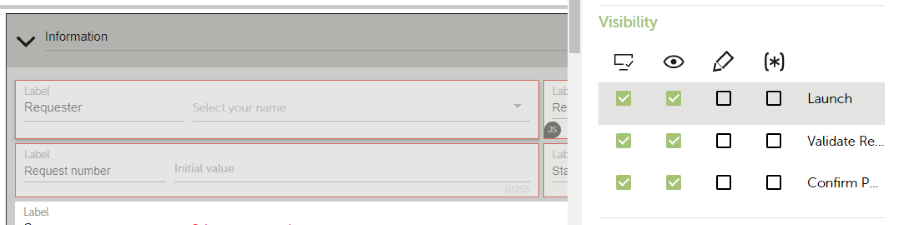
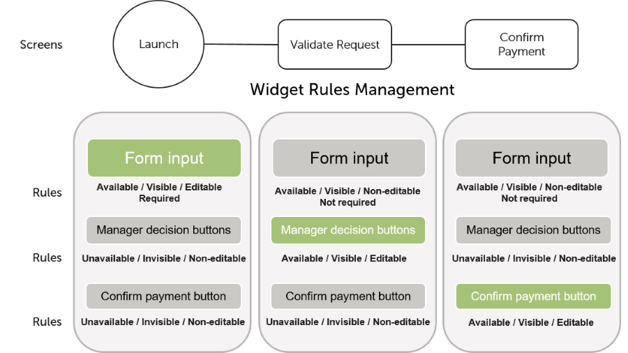
Under Visibility in the widget properties, set the visibility rules for the initial and new widgets of each screen. The rules define which design elements are available (also in the background), visible, or active (can be edited), for example:
For further details about web interfaces, refer to:
Using Widgets
The main components of a web interface are widgets of the following types:
- Text, number, date, email, URL input fields
- History & comments
- Sections & tabs
- Static texts
- Lists
- Checkboxes
- Radio buttons
- Arrays
- Buttons
- HTML blocks
- File upload widgets
- Progress bars
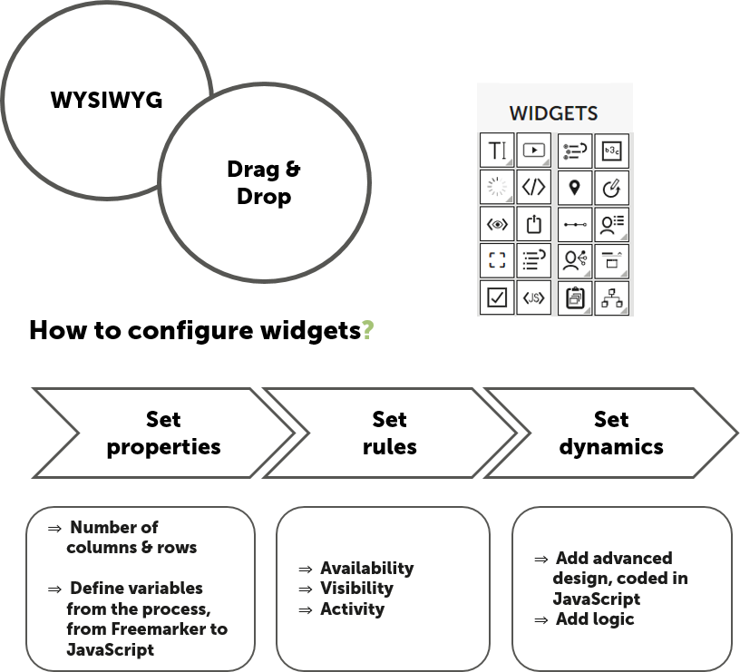
The following image illustrates the usage and configuration of widgets in the WebModeler:
For details, refer to Widget Types.
Sample Application
The image below shows the web interface of the sample application as exposed to users. It contains the following elements:
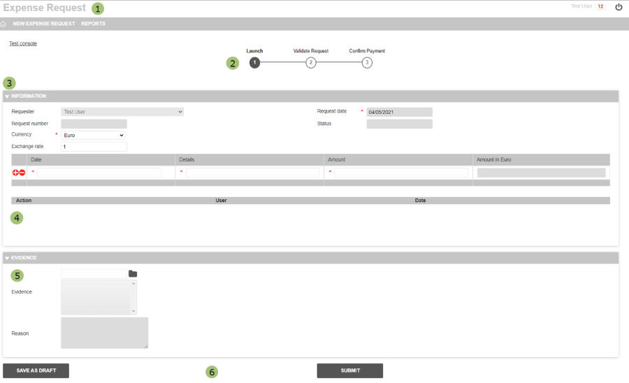
| Number | Description |
 |
Header displaying the application name, the connected user, and a menu bar. |  |
Progress bar displaying the main process steps. |  |
Information section providing the details of the expense request. |  |
History section to track the actions for the request and add notes in a comment. |  |
Evidence section including the possibility to attach files and add notes. |  |
Submit and Save buttons. |
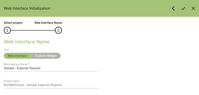
To create the web interface of the sample application, proceed as follows:
- Open the Sample Expense Request project.
- Create a web interface named Sample – Expense Request.
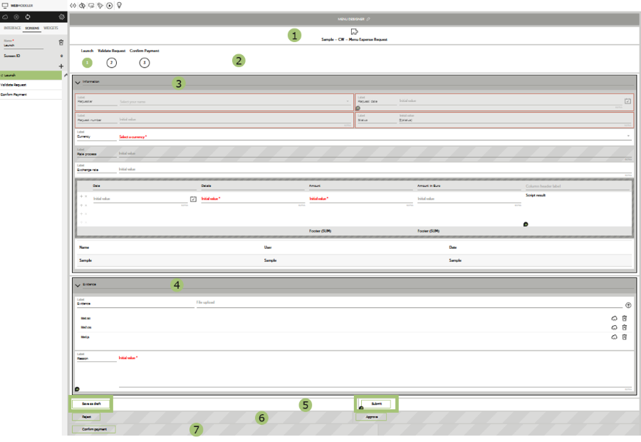
- Build the initial Launch screen with all widgets required for the process. For details, refer to Screens.
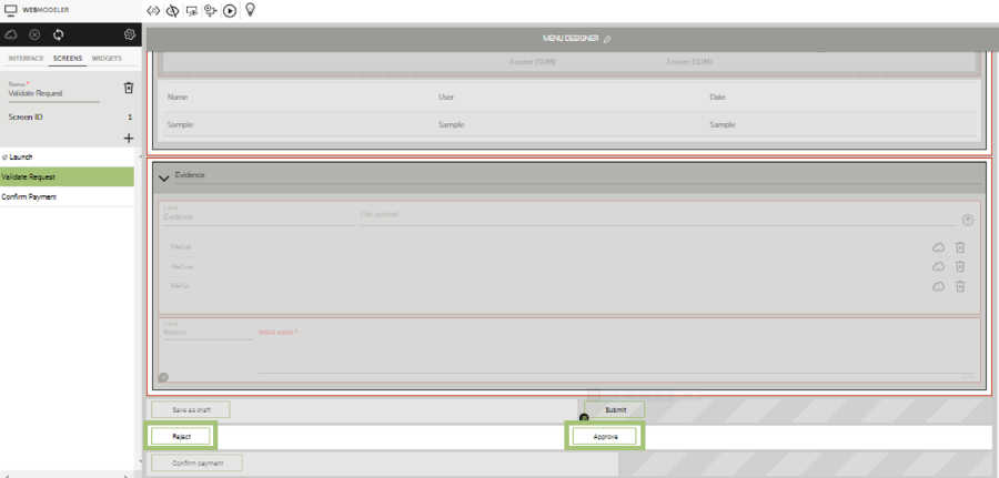
- Create and configure the additional screens for the Validate Request and Confirm Payment steps. For details, refer to Screens.
- Add the buttons for rejection and approval to the Validate Request and Confirm Payment screens. For details, refer to Screens.
- Set the rules on the initial and new widgets for each screen as outlined in the figure below.
For general information about screens, refer to the description of the screen concepts.
Screens
The web interface consists of three screens reflecting the process steps and tasks of the different users involved in the process:
-
Launch screen: On this screen, the employee will enter the data for the expense request. It contains all elements described above.
| Number | Widgets |
|
Custom widget which builds the header and the menu bar. This custom widget contains the menu bar definition in JavaScript. For details, refer to Menu bar in the Developer Guide for the Advanced IDE. |
|
Progress bar widget to indicate the current process step. |
|
Information section including the following widgets:
|
|
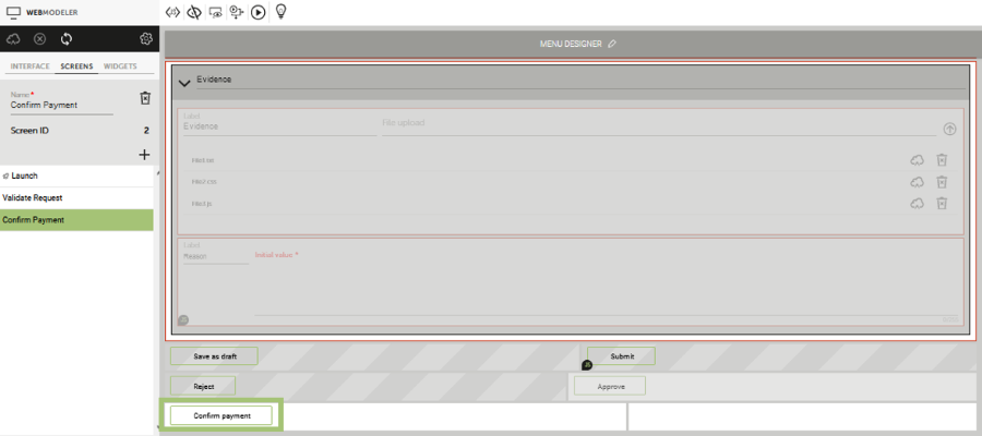
Evidence section including the following widgets:
|
|
Save as draft and Submit button widgets for the Launch screen. |
|
Submit button widgets for the Validate Request screen. |
 |
Submit button widgets for the Confirm Payment screen. |
For details about widgets, refer to Widget Types.
-
Validate Request screen: On this screen, the manager can view the entered expense request data and either reject or approve the request. The input elements are deactivated except for the Reason text input field.
-
Confirm Payment screen: On this screen, a member of the administration team confirms the payment. The input elements are deactivated except for the Reason text input field.