Easy Builder
Easy Builder is a streamlined environment that enables people with no programming skills to build straightforward applications quickly.
1 Overview
The sophistication of DigitalSuite Studio can be daunting for users who need to develop a straightforward application quickly. Easy Builder has been designed specifically for these situations; much of the advanced functionality has been removed resulting in a simple, intuitive tool which enables novice users to build straightforward applications quickly.
2 Accessing the application
Easy Builder can be found in the 'Build Applications' section of your RunMyProcess homepage. When you first access the system you will be guided through the steps needed to build an application. You can return to this mode at any time by choosing to Launch Tutorial Mode from the help section or you can choose to close the tutorial by closing the pop up window.
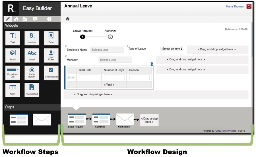
3 The Easy Builder Environment
There are essentially two main components to an Easy Builder application - the Web Interface and the Workflow. The Easy Builder interface reflects this and as a result is comprised of two sections - one that enables you to design your user interface and the other that enables you to design your workflow.
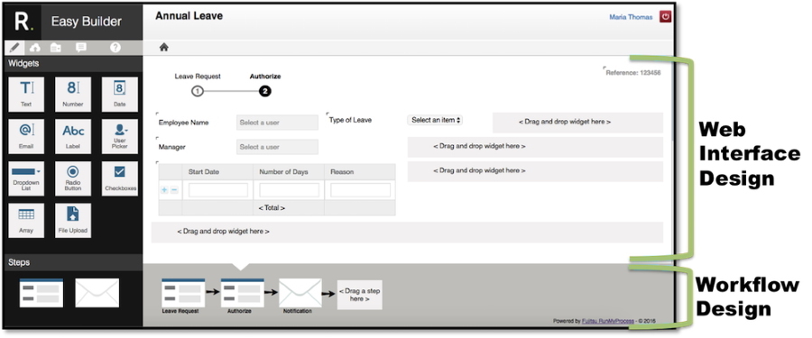
EasyBuilder makes use of drag and drop to enable users to drag widgets onto their web interface designs and steps onto their workflows. Available widgets and workflow steps are chosen from the selection on the left.
If a user clicks on a resource (widget or workflow step) within their design the leftmost panel will change to enable the user to configure that widget / workflow step.
4 Building an application
The four basic steps involved in building an application are:
- Name your application
- Create your Web Interface
- Create your Workflow
- Save and deploy your application
These steps are not strictly sequential, the web interface and the workflow are usually developed concurrently.
4.1 Naming your application
There is an area reserved for the name of your application at the top of the screen. To name your application, simply click on this area and enter a suitable name.
4.2 Language Preference
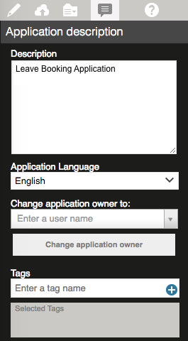
You can choose a language for your EasyBuilder environment - you have a choice of French, English, Spanish or Japanese. If your preferred language is one of these then Easy Builder uses this language as default. Your preferred language can be set using the My Settings module of DigitalSuite Studio. To choose a different language for Easy Builder, click on the Application description icon  and choose the language you would like from the drop down list.
The language of the Easy Builder tool itself will change and also the standard Easy Builder text used in applications at run-time.
4.3 Designing your Web Interface
Designing a form (page) for your application is straightforward. Your web interface is composed of various widgets which you choose according to your requirements. Widgets are dragged from the left pane and placed on the canvas on the right pane. You can move them around until you're happy with the way they look.
Widget Selection
Widgets are added to your application, not to a specific form. This means that after designing your initial form, any subsequent forms you add to your workflow will automatically have the same widgets. You can set the visibility and editability of widgets at form level.
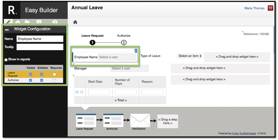
4.3.1 Widget Properties
Each widget has properties that can be set in order to customise it for your application. To set the properties for a widget, click the widget on the canvas and the options will be displayed in the left pane.
Most properties are common to most widgets and are described here.
Name This is the label for the widget i.e. the text that will be displayed next to the widget.
Tooltip This is what the user will see when they hover their mouse over the widget, this text should help the user.
Show in Reports This should be ticked to include this field in reports.
At the bottom of the properties pane, you can set three fields - visible, editable and required. These can be set for each form in the workflow.
Visible This should be ticked if this widget is visible on this form;
Editable This should be ticked if the user can change the value of this field on this form; otherwise the user will be able to view the information but not change it.
Required This should be ticked if the user must enter a value for this field.
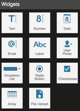
4.3.1.1 Text
The text widget is used to capture or display a piece of textual information. The text widget has the following additional properties:
Default Value Entering a value here will mean that this text field will take this value as a matter of course; users will be able to overwrite this value.
Lines This sets the number of lines that the text box should use.
Chars The maximum number of characters allowed for this text field.
4.3.1.2 Number
The Number widget should be used when the user needs to enter or view a numeric value. An initial value can be set for number fields in the Default Value property, this means that the number will be set to this value as a matter of course; users will be able to change this value when entering data.
4.3.1.3 Date
The Date widget should be used when the user needs to enter or view a date field. You can choose a suitable format for your date.
4.3.1.4 Email
The Email widget should be used to capture email addresses. This field can be pre-populated with an email address of your choice by entering the address in the Default Value property, the user will be able to change this email address if the widget has been set to be editable.
4.3.1.5 Label
This widget enables you to add a piece of text to your form. You can choose the size of the text by setting the size property to be small, medium or large. The text in a label is not editable by the user and therefore the editable and required properties are disabled.
4.3.1.6 User Picker
This widget provides a list of users from which the user can choose one. The user can start typing a name and the list is filtered dynamically based on the user's entry. This is a powerful widget as it can be used to assign tasks to the chosen user (see section 4.4.2 Validation Forms).
4.3.1.7 Dropdown List
This widget enables you to offer the users a list of values from which they can choose one. You may have created lists for other widgets in which case you can choose to use them again with this widget. For help on using lists, see section 4.3.2 Using Lists.
4.3.1.8 Radio Button
Radio buttons enable the users to choose one item by clicking on the small circle next to their choice.
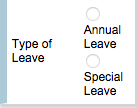
Like the dropdown list, this widget requires a list of items, with each element of the list representing each option. For help on using lists, see section 4.3.2 Using Lists.
The orientation property enables you to display your radio buttons either vertically down the page or horizontally across the page.
4.3.1.9 Checkboxes
Checkboxes are very similar to radio buttons in that they enable the users to choose one item. Checkboxes appear as squares next to the choices.

This widget requires a list of items, with each element of the list representing an option. For help on using lists, see section 4.3.2 Using Lists.
4.3.1.10 Array / Table
The Array widget allows the user to enter data into a table.
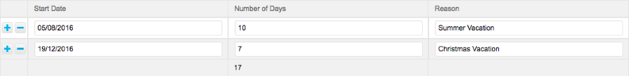 Table at runtime
A table can have a maximum of four columns, there is no limit to the number of rows that a user can enter when using the table.
Each column can be configured by clicking on the widget on the canvas.
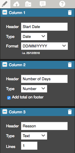
Columns are customisable. A heading can be specified for each column by editing the Header field and a data type chosen from Date, Text or Number. A format can be chosen for Date columns from a wide selection available. The number of lines that Text fields should take can be specified. Finally, Number columns can have the column total calculated and displayed at the bottom of the table.
4.3.1.11 File Upload
This widget enables the user to upload files to the RunMyProcess server.
4.3.2 Using Lists
Dropdown Lists, Radio Buttons and Checkboxes all use lists to offer the user a choice of values. Once you have created a list you can use it for more than one widget.
You can create new lists from the properties pane for the widgets that use lists, click on the widget on the canvas and the properties pane will open in the left pane. You can create the list by clicking on the pencil next to the List of Values property.

This will open the list configuration pane from where you can create your list.
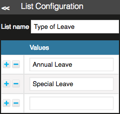
List Name Give your list a name. Any subsequent widgets that use lists will offer you the option of using this list.
Prompt This is the text displayed before the user chooses a value from the list.
Values Add the elements of your list here. To add a new value click on the  symbol, this adds a new row where you can enter the new value. The
  symbol will remove any unnecessary values. You can edit your list of values at any time by clicking on the pencil icon and following the same procedure.
4.4 Designing your Workflow
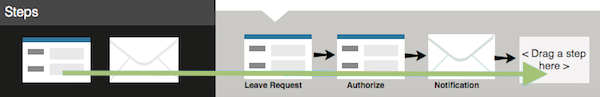
The workflow defines the steps involved in your application. Applications built using Easy Builder are made up of forms (i.e. pages) and email. The workflow defines the order in which these occur.
You build your workflow at the bottom of the Easy Builder interface.
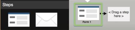
All workflows start with a form, which is automatically added to your workflow design. This form launches your process when the user clicks the 'Submit' button. To add other steps (email or additional forms), drag them from the steps pane onto the workflow design pane in the order that they are required. You will need to configure each step by clicking on it in the workflow design pane; this will open a configuration pane on the left side of the screen.
4.4.1 Launching Form
All Easy Builder processes are launched manually by a user accessing the application and submitting a request. The first step in all Easy Builder applications is therefore a form which is automatically placed onto your workflow design when you start to build a new application.
To configure the form, click on it on the workflow design pane. This will open a properties window in the left pane.
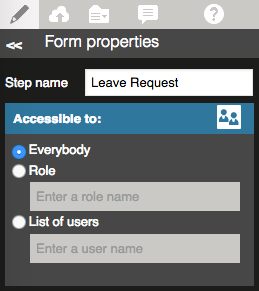
Setting a value for Step Name gives the form a name in your workflow design and will also be used in notifications and when viewing the process history. Giving a meaningful name makes your workflow and the application much easier to understand.
Within the Forms Properties pane, you can specify who has access to the form which, in the case of the launching form, will mean that these people have the right to launch the process. You have the following options:
-
Everybody
This option makes the form available to everyone in the organisation. -
Role
Static, Scripted & Everybody roles can be shared so that they are available in EasyBuilder, choosing a role here will give its members permission to open the form and so launch the process. You can share a role from the Role Management module of DigitalSuite Studio. See Roles and Access Rights for detailed information on roles. -
List of Users
This option allows you to limit the accessibility to a specified list of users. You will be need to enter at least one character; matching users will be displayed for you to choose. Only users specified here will be able to open the form.
You will notice a section at the bottom of the canvas that you cannot edit.
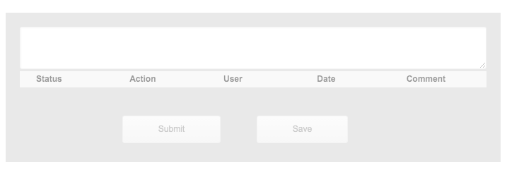
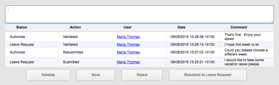
The first part of this section allows the user to add a comment to their request, this comment will be displayed in the process history section which can be found immediately underneath the comments box.
The process history displays the history of the launched process i.e. the steps it has already been through; the following information is displayed:
Status: This displays the process step name (i.e. the name you gave to the form or the email step) or 'Complete' for completed processes.
Action: This shows the action taken by the user at this step. This corresponds to which button they pressed.
User: The name of the user that took this action.
Date: The date the action was taken.
Comment: Any comment added by the user at this point.
The buttons at the bottom of the screen represent the actions that the user can take. Clicking on Submit will launch the process and move to the next step in the workflow and clicking on Save will save the data but not launch the process. The save will be noted in the history and the user can return and submit the request at any point.
4.4.2 Validation Forms
It is likely that your application will require more than one form, subsequent forms are essentially tasks that need to be manually completed in order for the process to progress. To add a new form, click on your workflow design and drag the form icon from the steps pane onto your workflow.
Clicking on the new form in your workflow will display it on the canvas and its properties will be displayed in the left hand pane. You will notice that the widgets on the form are the same as the launch form, you will need to click on each widget and set the visibility and editability flags to be appropriate for the new form.
Forms other than the initial launching one have additional properties that can be set. To see the form properties, click on the form in your workflow design and the properties will be displayed in the left hand pane.
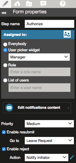
Assigning the task
Within the Forms Properties pane, you can specify who has the authority to complete the task represented by the form. You have the following options:
-
Everybody
This option makes the form available to everyone in the organisation. -
User Picker Widget
If your web interface makes use of a User Picker widget then this option will make the form available to the person specified in that widget. For example, consider an annual leave submission workflow. The workflow is launched when an employee wants to request some holiday leave. The launching form uses the User Picker widget which allows the user to specify who, from a group of users, should authorize the leave. When designing the authorization form, the user picker widget option can be used to specify that the person chosen by the original employee can use this form to authorize the leave. -
Role
Static, Scripted & Everybody roles can be shared so that they are available here to assign tasks to. You can share a role from the Role Management module of DigitalSuite Studio. See Roles and Access Rights for detailed information on roles. -
List of Users
This option allows you to limit the accessibility to a specified list of users. You will be need to enter at least one character; matching users will be displayed for you to choose. Only users specified here will be able to open the form.
If more than one user has been given the authority to complete the task, only one will be required to do so. After a user has completed the task the other users will be able to view, but not edit, the task.
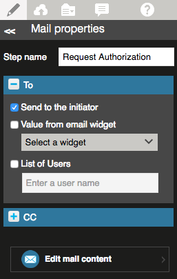
Notification
You will notice a button on the properties pane to Edit notification content. Clicking this button opens up a pop up window that allows you to manage the notification for the task.
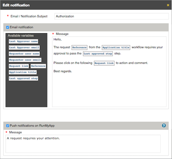
There are two modes of notification - Email Notification or Push Notification on RunMyApp. The email notification sends an email to the user(s) specified to let them know that they need to complete a task, it also gives them a link to the form. You can specify the email's subject and edit the content of the email.
There are several variables that you can use in the email body. Some are used in the pre-configured text and you can add others by dragging them into the body of your email, they can be deleted by using the delete key on your keyboard. An explanation of each variable is given in section 4.4.3.1 Email Variables
You can choose to send a push notification on RunMyApp and edit the message from here.
Priority
On the form properties pane for forms other than initial ones, you can set the priority of the task - High, Medium or Low; this priority will be displayed on the notifications as a visual tag for the person responsible for completing the task. You can also enable two additional buttons on the bottom of the screen - Resubmit and Reject.
Resubmit and Reject
The Resubmit button allows users to set the process back to a previous step. The resubmit will be noted in the process history and the users responsible for the step the process is resubmitted to are notified.
The Reject button will stop the request at that step, the process won't progress to the following steps. You can choose an action to take when the user clicks on Reject - you can either do nothing or send an email to the initiator to explain that the request has been rejected. Clicking on the pencil icon opens a pop up window that enables you to edit the content of this email.
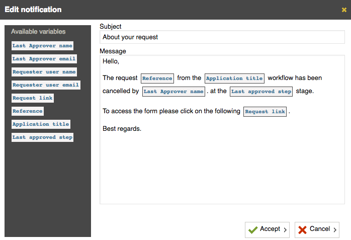
You can see that there are several variables that you can use in the email body. Some are used in the pre-configured text and you can add others by dragging them into the body of your email, they can be deleted by using the delete key on your keyboard. An explanation of each variable is given in section 4.4.3.1 Email Variables
If you enable the resubmit or reject buttons they will be visible in the bottom section of the canvas. This section appears on all forms and is not editable.
This first part of this section allows the user to add a comment regarding the action they are taking, this could be used to explain the action e.g. why they are rejecting the request. The comment will be displayed in the process history section which can be found immediately underneath the comments box.
The process history displays the history of the launched process i.e. the steps it has already been through; the following information is displayed:
Status: This displays the process step name (i.e. the name you gave to the form or the email step) or 'Validated' for completed processes.
Action: This shows the action taken by the user at this step. This corresponds to which button the user pressed.
User: The name of the user that took this action.
Date: The date the action was taken.
Comment: Any comment added by the user at this point.
The buttons at the bottom of the screen represent the actions that the user can take. Clicking on Validate will progress the process to the next step in the workflow and clicking on Save will save the data but not progress the process. The save will be noted in the history and the user can return and validate the request at any point. If enabled the Resubmit button can revoke the process to a previous step while the Reject button will stop the process.
4.4.3 Email Steps
A step in a workflow can be to send an email. To add an email step to your workflow click on the workflow design pane, choose the email icon from the steps pane and drag it onto your workflow.
To configure an email step, click on it on the workflow design pane. This will open the properties in the left pane.
Setting a value for Step Name gives the email step a name in your workflow design and will also be used in notifications. Giving a meaningful name makes your workflow easier to understand.
You can choose recipients for your email by setting the To property and you can choose who should be copied into the email by setting the CC option. There are a few different ways of setting who should receive and be copied into emails.
Clicking on Send to the initiator will result in the email being sent to the person who launched the process, i.e. the person who submitted the first form.
Your web interface may make use of an email widget, this is a widget that is used to enable the user to enter an email address. Clicking on Value from email widget here means that the email will be sent to this email address.
The final option for specifying who should receive the email is to use List of Users. This enables you to specify more than one user to receive the email. You will be required to enter at least one character of the user's name; matching users will be displayed for you to choose.
You can write your email by clicking on Edit email content
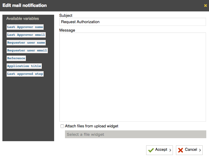
The subject of the email is set to be the name given to the step but this can be overwritten. You can write the body of the email here and specify that you want to attach a file, the file will have been uploaded using a File Upload widget on the web interface - you will be required to specify which File Upload widget you want to use, as you may have more than one.
4.4.3.1 Email Variables
There are several variables that you can use in your email by dragging them from the list on the left to the email on the right.
The available variables are:
Last approver name: This is the name of the person who is responsible for completing the task that the email is asking them to complete.
Last approver email: This is the email address of the person who is responsible for completing the task.
Requester user name: This is the name of the person who initiated the process.
Requester user email: This is the email address of the person who initiated the process.
Reference: This is a unique identifier for each request. It can be found on the top right corner of each form.
Application name: The name given to your application. This can be found on the top of each form and can be changed by clicking on it.
Step name: The name of the step in the workflow that requires the user's input.
4.5 Adding Advanced Features
If you find that your application requirements cannot be met by Easy Builder you can open and add features to the application using DigitalSuite Studio.
Please note however that you cannot open applications that have been developed in DigitalSuite Studio in Easy Builder.
5 Saving and Deploying your application

5.1 Saving your application
Clicking on on the menu bar will save your application and give you the option of running the application in test mode, deploying it for acceptance testing or publishing it to the live environment.
5.2 The placement of your application on the homepage
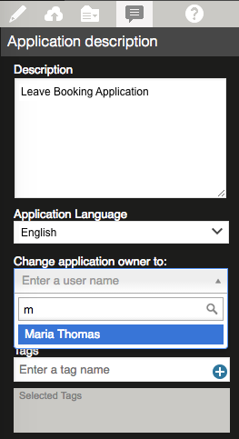
Before deploying your application it is good practice to add a description and tags to it. The description will help users find the correct application and the tags determine where the application is sited on the homepage.
If the tag you enter is already a section on the homepage, your application will be placed within this section. If you enter a tag that doesn't already exist as a section of the homepage, a new section will be created and your application will be placed here.
To enter a description and tags click on on the menu bar.
5.3 Deploying your application
Clicking on on the menu bar will save your application and give you options for deploying your application to three environments - Test, Acceptance and Live.
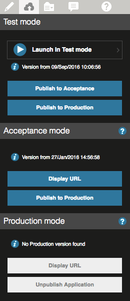
5.3.1 Test Environment
To test your application, click on Launch in Test Mode. Your application will open in the browser and you will be able to test that it works as intended. Whilst in Test mode, the only user involved is the one that initiated the test, this means that all tasks are assigned to the current user and all notifications are sent to the same user. All emails will be sent to the tester, although they will note who would have received them in a real situation.
5.3.2 Acceptance Testing
When you are ready to receive feedback from other users on your application click on Publish to Acceptance. This will enable two buttons in the Acceptance Mode section, Display URL and Publish to Production. Display URL will give you a web address to share with the users you would like involved in acceptance testing.
In acceptance mode tasks are assigned to the actual users and notifications and emails are also sent to the actual users that they are meant to.
The data in Acceptance mode is not held permanently.
5.3.3 Publishing to the Production environment
Publishing your application to the production environment means that it will be available for users to use. Clicking on Publish to Production will enable two buttons in the Production Mode section, Display URL and Unpublish Application.
Display URL will give you a web address for accessing the application directly, the application will also be accessible from the homepage.
Unpublish Application will remove your application from the production environment and users will no longer be able to access it.
6 Editing your applications
Changes can only be made by the application owner. To make changes, the owner will need to open the application by clicking on  . Any necessary changes can then be made and a new version deployed.
6.1 Changing the application owner
To change the owner of an application, the current owner will need to click on and select a new owner using the User Picker. Please be aware that the original owner will no longer have access rights to the apllication in EasyBuilder, applications have only one owner and only the owner can access the application.
7 Reports
When your application is running, there will be a Reports option on the menu bar. Clicking this will give you information on the usage of the application.
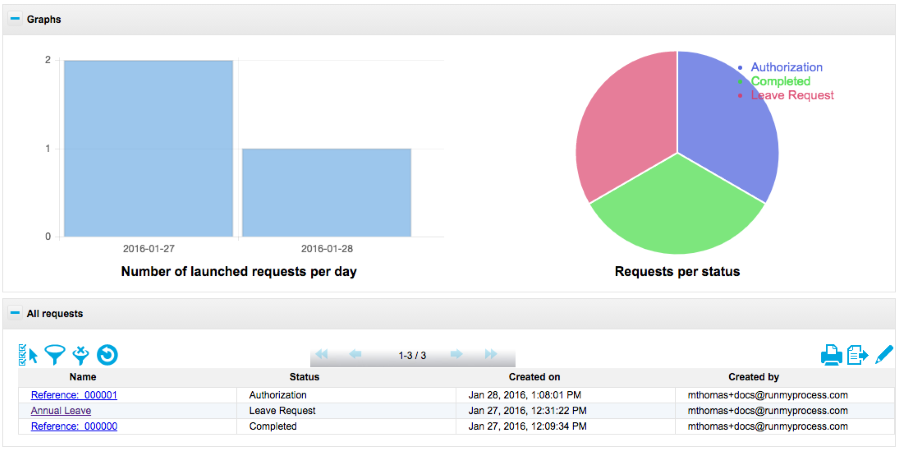
The graphs provide a pictorial representation of the number of requests launched and the status of these requests. For requests that have not completed the status is the step of the workflow that they are currently at.
The bottom section gives you information on each request that has been submitted.
7.1 Report Filters
There are filters to help you locate a specific request or group of requests that you are interested in. Click on  to enable the filters.
You will need to choose the type of filter you require from the list provided and enter the criteria in the box beneath.
Clicking on  removes all set filters and all requests are displayed.
7.2 Exporting report data
It is possible to export a page of records to a file by clicking on the  button. Choosing the Your default export option will produce a csv (comma separated values) file using UTF-8 character encoding. Choosing the "Customize" option gives you options for the file produced; namely the character used to separate the fields, the character encoding system used, the decimal separator and the format of dates.
8 Glossary
| Term | |
|---|---|
| Canvas | The area of the screen where you design your web interface. |
| Form | A page or screen of your web interface. |
| Web Interface | The pages that your users will see when using the application. |
| Widget | Web interfaces are composed of widgets. Each element of your web interface is a widget e.g. a drop down list. You drag and drop widgets onto your canvas to create a web interface. |
| Workflow | The steps involved in your application; Easy Builder applications consist of screens and emails, the workflow defines the order in which these occur. |